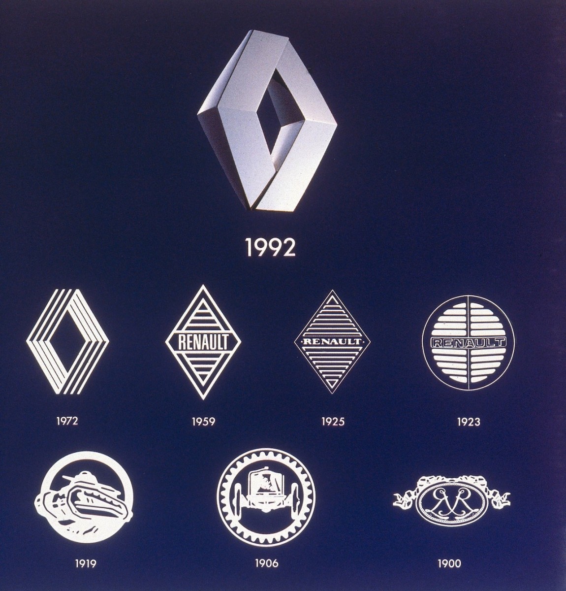
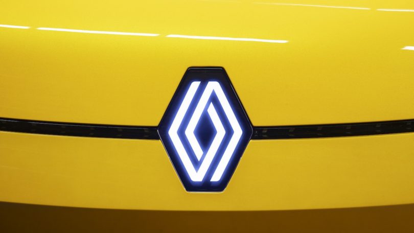
Renault has revamped its iconic Rhombus logo under the new Renaulation initiative. The new iteration is the brand’s 9th logo design since the brand adopted the diamond-shaped logo back in 1925. The current logo though is fairly new, introduced in 1992 and the update was initially unveiled in January 2021 but the brand deployed the new logo only a few days back.
New Logo Design
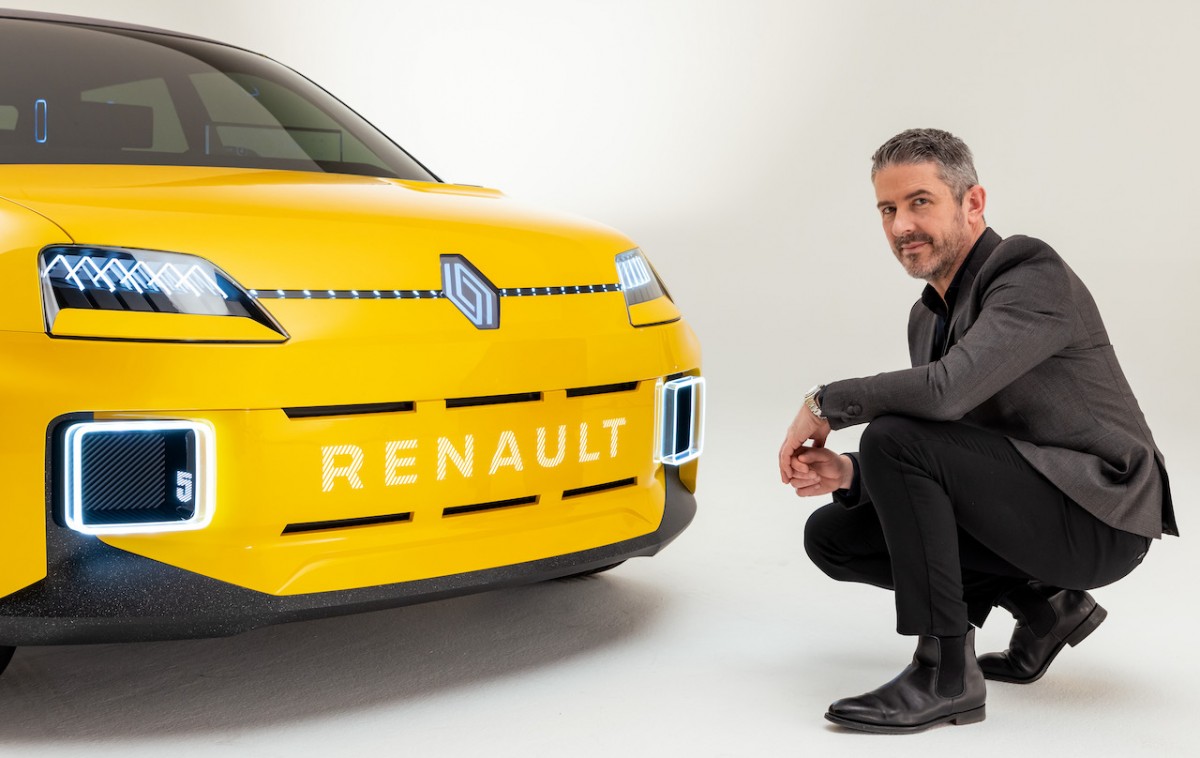
The new Renault diamond was displayed behind Luca de Meo, CEO of Renault during the presentation of the Renaulation plan as well as on the grille of the Renault 5 prototype. The brand has also deployed the new logo in the Renault Zoe’s advertisement campaign and on the brand’s social media networks. The new logo is in line with the brand’s push towards the digital world and showcases the brand’s electrification efforts.
Renault Diamond History
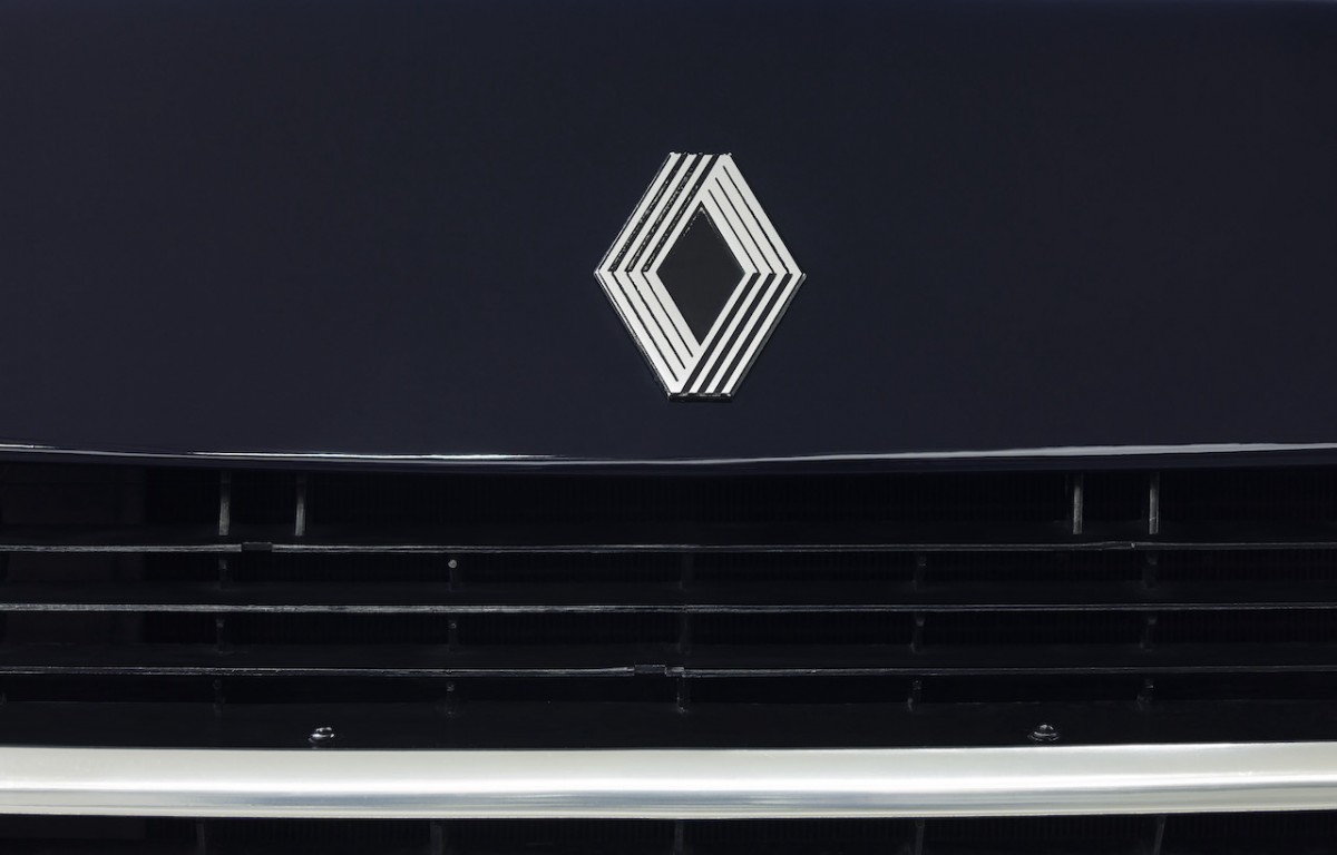
The Renault diamond has been synonymous with the brand since 1925 and it is one of the most recognisable logos in the automobile industry. The Renault diamond is redesigned at least 8 times in its course of history showing the brand evolution with time. The last iteration came into existence in 1992 and the latest version was understudy since 2019 and is in tune with the new era of digitalization.
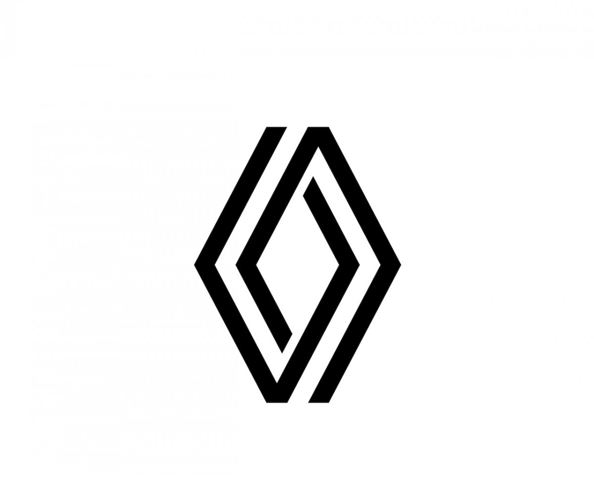
The New Renault Diamond
The brand preserves the original diamond shape of the logo and uses lines that give the new logo with two lozenges intertwined by an optical illusion. The new logo is of the minimalist type and does not come with any typography. The flat features also allow the brand to integrate animation in the new logo in a video or digital media as well as on Renault vehicles for a welcome sequence.
Timeline
The brand has also announced that the new logo will be gradually applied to vehicles launched from next year and the entire range of Renault vehicles will carry the new logo by the year 2024.
