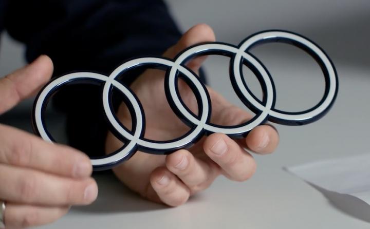

Audi has revealed a redesigned new logo. The iconic four-ring logo has debuted with the recently launched Audi Q8 e-tron.
Audi has retained the four rings but they have now been redesigned to reflect the brand’s classic logo. The logo now gets a two-tone appearance with a contrasting black background. The rings are finished in white colour. The logo gets a two-dimensional design and it is expected to be offered on other models across the Audi range in the future.
While there will of course be some variations in the logo, including a black and grey design, all the versions will have a two-dimensional appearance. Frederik Kalisch, a strategist, explained that the 2D logo came into existence back in 2016 thanks to digitalization. The rings can be depicted as per the suitable medium. That said, the car maker wanted to have a more consistent brand presence across all the customer touchpoints. Hence the rings were redesigned as well.
Logo Designer Andre Georgi also said the same. The new logo will appear the same in a magazine, a smartphone or a hoarding or even inside a car. This was also the company’s vision. In terms of geometry, the new logo is identical to the outgoing one, just that it gets a more graphical change.
The logo has also been devoid of chrome. This has been done deliberately, but all past Audi logos made use of chrome, which has now been a tradition of the car brand.
Apart from the logo, Audi will also be using a new font called the Audi Type. As per Andre Georgi the font tone has been restrained but there have been no compromises made on the distinctiveness or the quality. All future models of the brand will come with this font.
Also Read – 2023 Audi Q8 e-tron revealed with longer range